BizWiz
What is BizWiz?
BizWiz is a mobile app that helps teens ages 13-19 learn more about personal financing. They are able to learn budgeting and achieve saving goals in a user-friendly and interactive manner.
Objective: The Google Design Sprint methodology was used to create an app that's user friendly, interactive and an overall encouraging space for teens who want to learn more about finance.
BizWiz Final Report
June 6-10: Phase 1
June 12-16: Phase 2
June 19-23: Phase 3
June 26-30: Phase 4
July 3-8: Phase 5
Timeline
Google Sprint Methdology
Phase 1: Understand and Define
The team came together to understand the problem at hand, define the challenge, and set the long-term goal.
Phase 2: Diverge and Decide
The team generated a wide range of ideas individually and then shared and discussed the ideas as a group.
Phase 3: Prototype
The team utilized the selected ideas to create a trail run of the app.
Phase 4: Test
The team conducted user testing with the prototype to collect feedback and insights and then refined the prototype based on the feedback.
Phase 5: Report and Reflect
The team summarizes the findings to identify what works in the sprint and what needs improvement.
To create our app, we used the Google Design Sprint methodology. This is a user-centered design approach that consists of five phases:
These phases are what allowed us to move the project along quickly and efficiently. We had to prioritize the most important aspects of our project, while decide which ideas could be put on hold. Overall, following the design sprint phases allowed us to create a practical mobile app.
Phase 1
Understand and Define
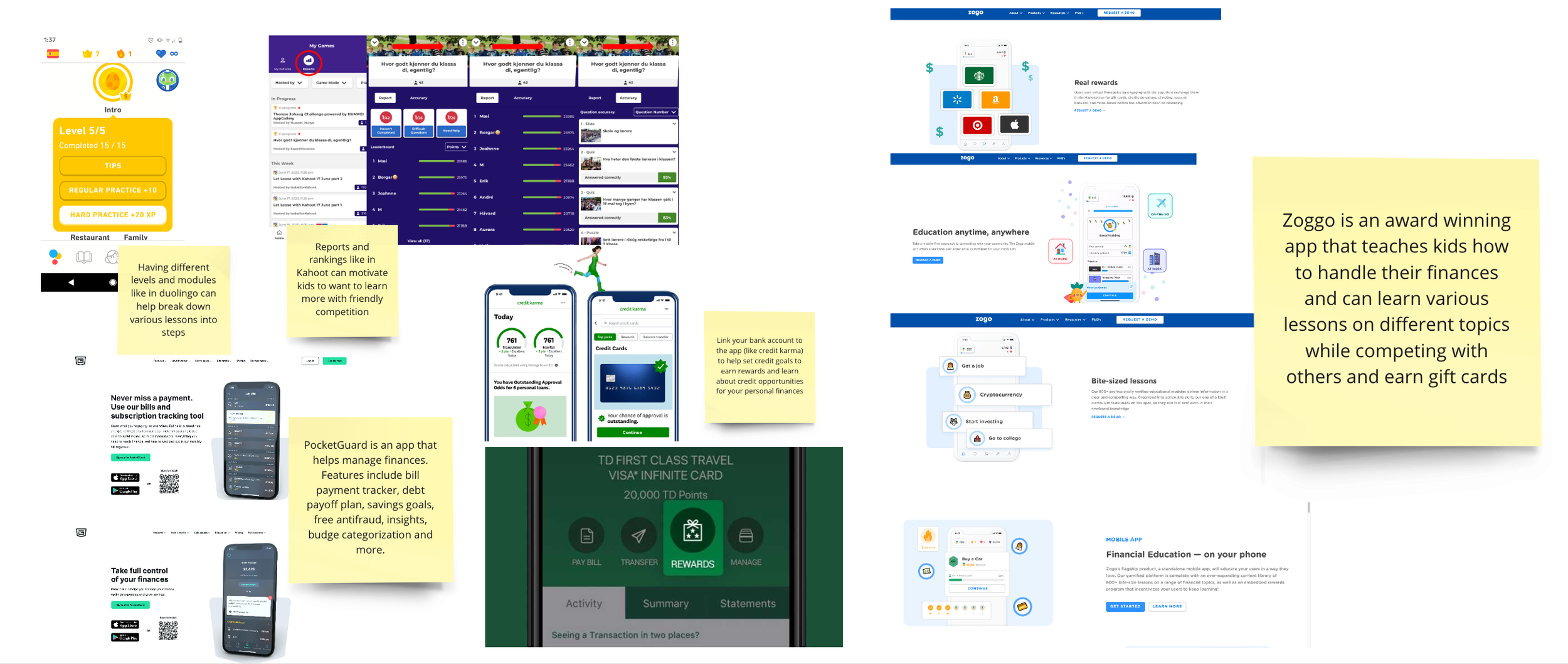
For phase one, the team first met to discuss ideas for the platform we wanted to design along with setting a game plan. During this process, we were deciding which platform would be the most practical that would attract 13 to 19 year olds. We were torn between a simulation game, website and app. With each platform, we asked a variety of questions such as:
Simulation game:
Do we want to keep the product more generalized or more personalized to the specific user?
Should there be levels for specific focus?
The idea of a game seems complicated, what do we think would be less complicated to conceptualize?
Website + Social Media Presence:
What will this brand do?
What is the purpose?
After asking these questions and trying to visualize the ideas, we ultimately pursued an app as it better targets the audience demographics due to accessibility and features a website, game, or social media brand wouldn’t have — such as push notifications. We then each thought of names and after sharing ideas, we agreed on ‘BizWiz.’
Mapping
Lightning Demos
4 Step Sketches
Notes
Crazy 8’s
Solutions
Phase 2
Diverge and Decide
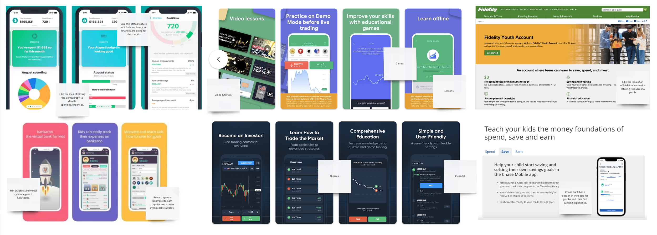
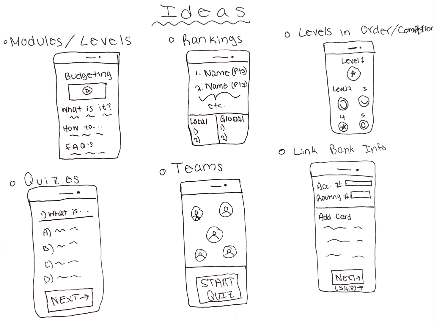
For phase two of the sprint, we took all our ideas from the lightning demos and sketches to be placed on a heat map, so the team could vote on which ideas are the best to pursue.
We started with voting on our solutions sketches. As the decider, I waited for my three team members to vote on their favorite aspects of the sketches. Once they were finished, I made decisions based on which features had the most amount of votes while also predicting what would work best together for an efficient product that would be realistic to build in the sprint timeframe. We used trophy emojis to indicate final decisions.
Next, we each created our own user flows. The six-step processes were created to summarize the experience the user would follow in the app. After everyone created their user flows, we did the same voting process.
After the votes were made and we decided on our primary user flow, we then built a story board composition. Each member chose two steps to be added in the composition. Two extra steps were added that were also voted on in the user flows. From there, we had a clearer understanding of where our app design was headed.
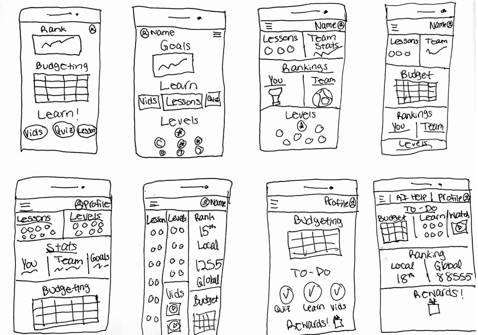
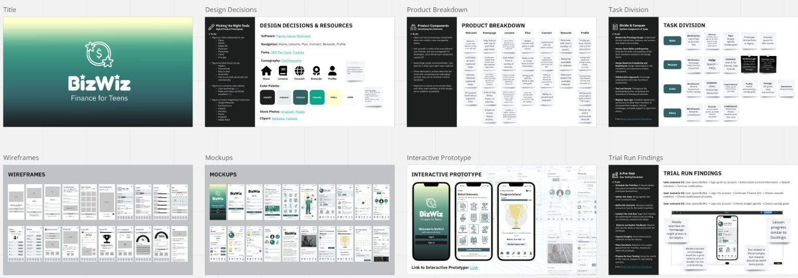
To complete phase two, we made a refined storyboard by each team member creating two wireframes for the two steps we chose in the storyboard composition. This process allowed us to visualize what our app could look like and created a foundation for the prototype.
Phase 3
Prototype
Product Breakdown
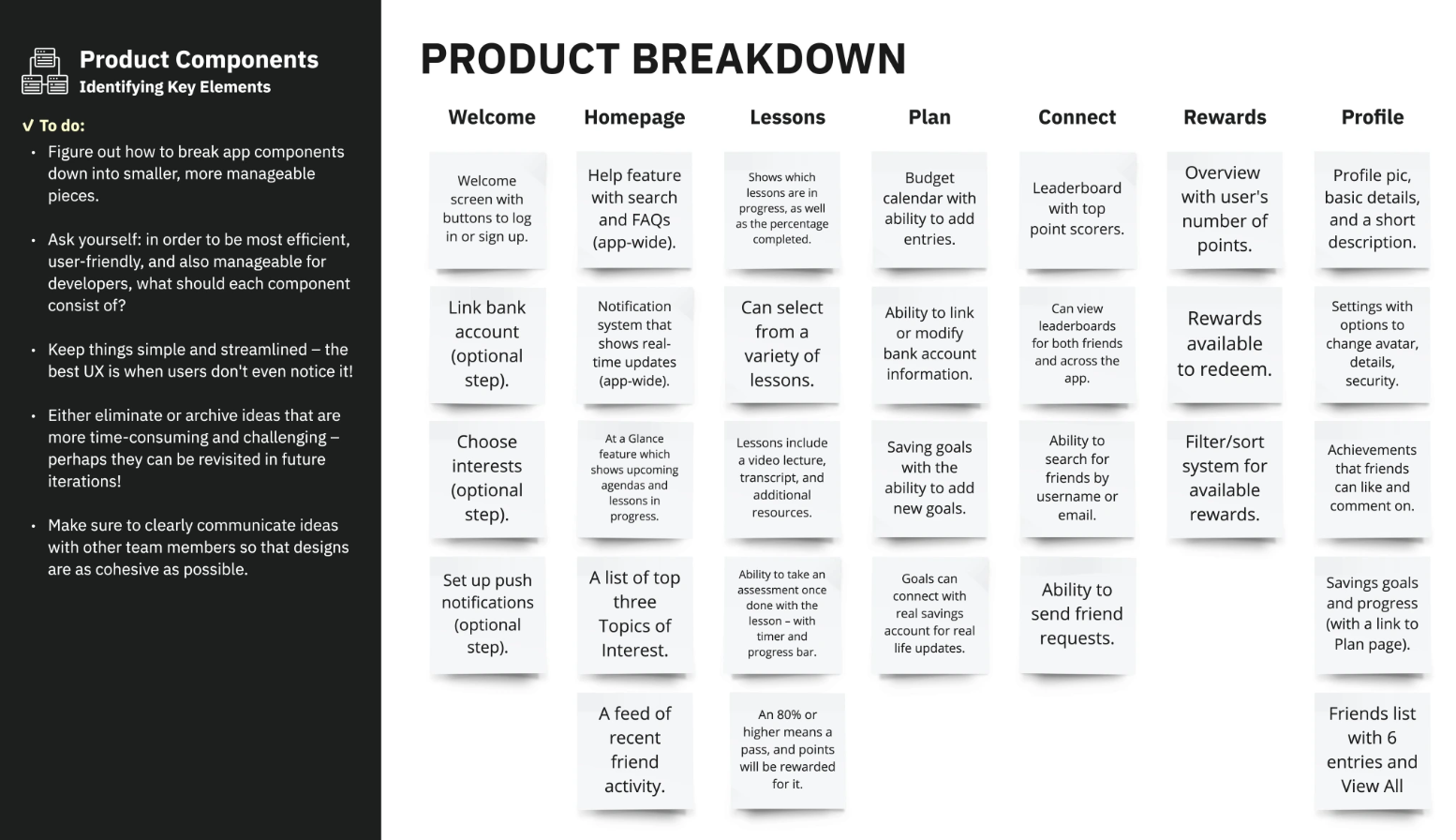
To begin our prototype for phase three of the sprint, the group met to plan the product breakdown. As a group, we decided to lay out each section/page of the app: Welcome, Homepage, Lessons, Plan, Connect, Rewards and Profile. From there, we added important features for each page. This helped the team know what would be needed in the prototype.
Task Division
After the team completed the product breakdown, we moved onto breaking up which team member would work on which wireframes. During this process, we were able to better plan which components are more important than others. Some ideas we had were put on the back burner, such as a guided tutorial and hamburger menu, as we knew there wouldn't be enough time to finish them in the prototype. They're ideas that are saved for later in the next steps.
Wireframes and Mockups
After we decided who would work on what, we each worked on our own individual low-fidelity mockups through Figma. During this process, we took elements from our storyboard and further refined them to make a cohesive app. Once the low-fidelity wireframes were complete, the high-fidelity mock-ups were created using Figma. The group decided to create a clean-looking app. With the use of color-theory, we created a blue-green theme to signify knowledge, reliability, calmness, success, wealth and growth, as these are the themes of BizWiz.
Interactive Prototype
After the mock-ups were created, the interactive prototype came together in Figma. We all met as a team and went over the interactive prototype together. We looked at the overall user experience, checked to see if we needed to refine certain details and ensured the app was consistent, aesthetically pleasing and wasn’t missing any gaps. Two takeaways we noted were having a weekly overview of the budget calendar in the homepage would be better for real estate and the overall experience as it’s less overwhelming. We also noted the rewards points should be higher. Overall, the team found the design of the interactive prototype and user experience didn’t need many fixes.
View the Prototype!
Phase 4
Test
Once the interactive prototype was complete, each team member recruited an interviewee to provide feedback on our prototype for the fourth phase of the sprint. We aimed for teens aged 13-19 or someone with background knowledge in finance.
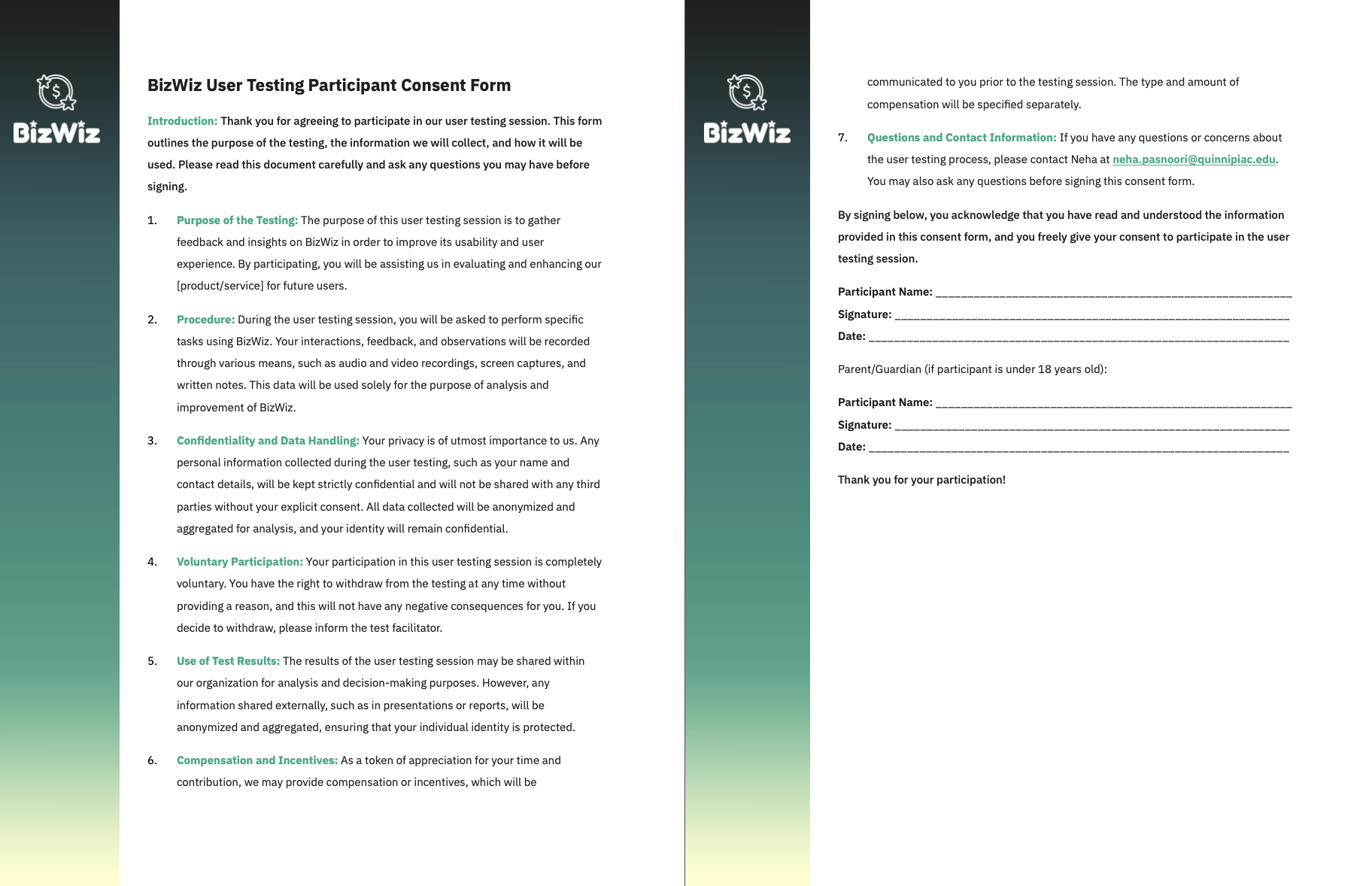
Consent Form
After each team member found an interviewee, we first had them fill out a consent form. We made sure the consent form matched the BizWiz brand.
Conducting the Test
Once each user signed the consent forms, we conducted Zoom interviews to guide them through the prototype and answer any question they may have while completing the survey. In the prototype, the users could follow one of the following:
User scenario #1: User opens BizWiz → Sign up for an account → Enters bank account information → Selects interests → Turns on notifications
User scenario #2: User opens BizWiz → Logs into account → Continues Finance 101 → Checks rewards redeems → Checks leaderboard of scores
User scenario #3: User opens BizWiz → Logs into account → Checks budget agenda → Checks savings goals
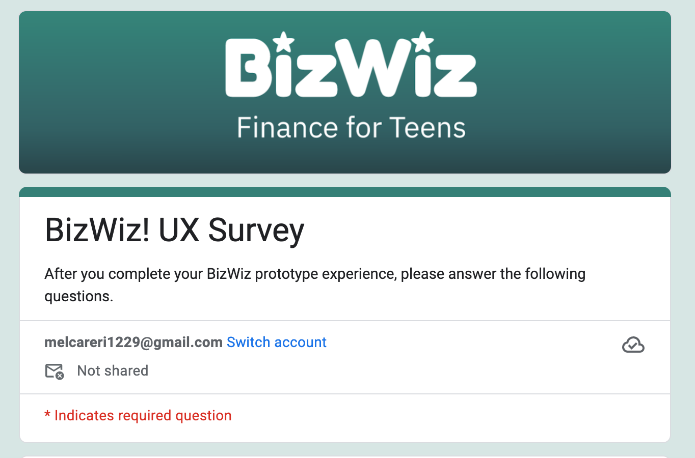
The survey was created through Google Forms as it would be an easy way to collect data. The questions for our surveys were taken from professional Google UX Design forms. We also created our own open-ended questions such as:
Is there anything else that could help enhance your experience?
Is there anything you found difficult to navigate? If so, where and why?
Should certain elements be emphasized more or less than others? If so, which ones?
Should certain elements be emphasized more or less than others? If so, which ones?
Results
In our testing, we learned users generally liked the concept and look of the app. Most of the feedback from our survey and one-on-one conversations was positive. Specifically, we got compliments on the layout, navigation bar, point system, and aesthetic. Users believed the app would be useful for teenagers to learn about finance and agreed it was easy to use. Some recommendations we received were primarily cosmetic, including making the buttons smaller for real estate. We were also told we could further emphasize video tutorials and add a beginner’s tab, such as finance 101.
Phase 5
Reflect and Report
For the final phase of the sprint, my team and I worked together on a report. Katie, Olivia and myself broke up the writing sections and gathering materials while Neha was our designer. The report explains the steps we took, our thinking and our methods while creating BizWiz.


